A news brand has one job before any other: to be recognised and trusted at the size of a thumbnail. WeNepal, the independent bilingual news platform for Nepal, publishes its entire identity in the open, with the rules for using it, at wenepal.com/brand. It is a good example of a brand built to work in two scripts and on a phone screen.
The pulse mark
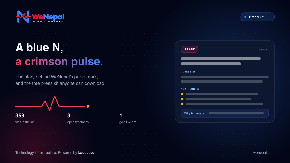
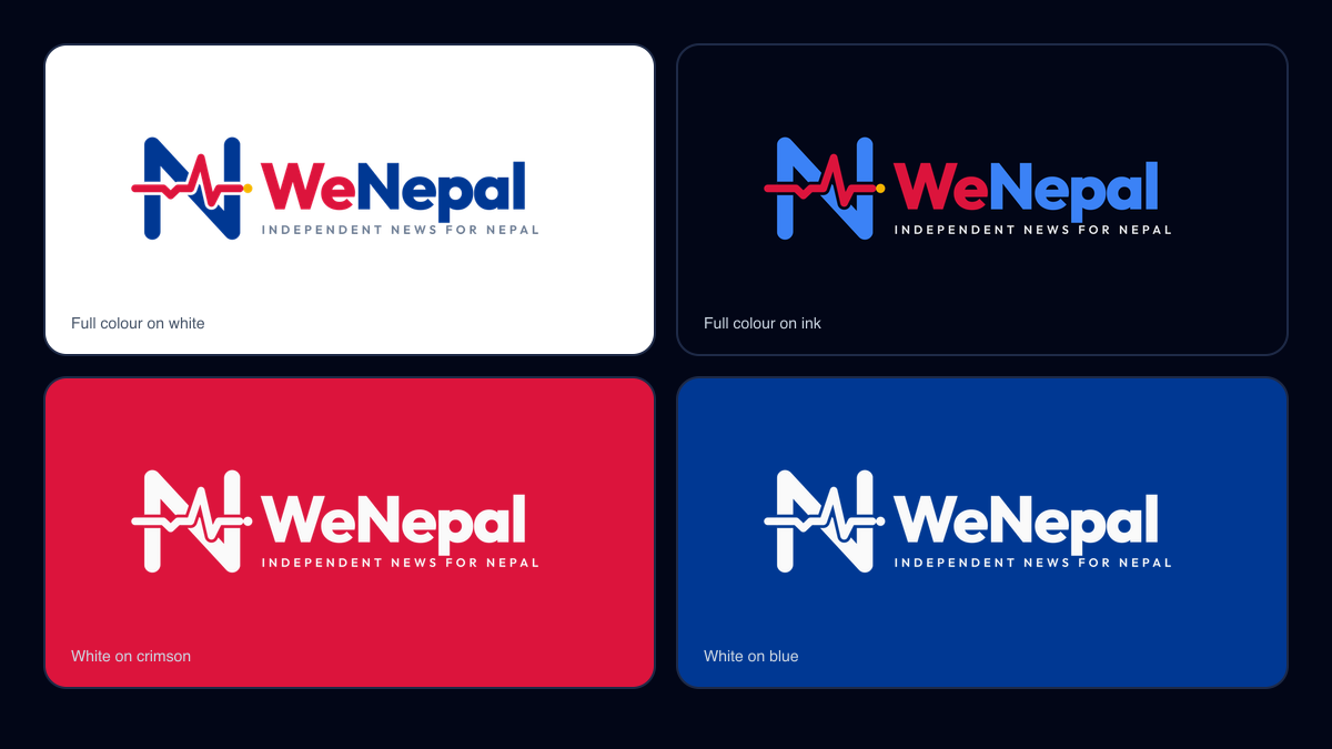
The mark is a blue N crossed by a crimson news pulse. The pulse always runs left to right and ends in a gold live dot. Crimson and blue are the colours of Nepal’s flag. One detail is easy to miss: the gap where the pulse crosses the N is part of the mark and is never filled.
The tagline is three words: Nepal, in minutes. In Nepali: नेपाल, मिनेटमै।
The name
It is one word with a capital W and a capital N: WeNepal. In Nepali it is वीनेपाल. The brand page asks writers not to use “We Nepal”, “WENEPAL” or “Wenepal” in running text. The main lockup carries the descriptor “Independent news for Nepal”, and the Nepali lockup “नेपालको स्वतन्त्र समाचार”.
The palette
| Colour | Hex | Role |
|---|---|---|
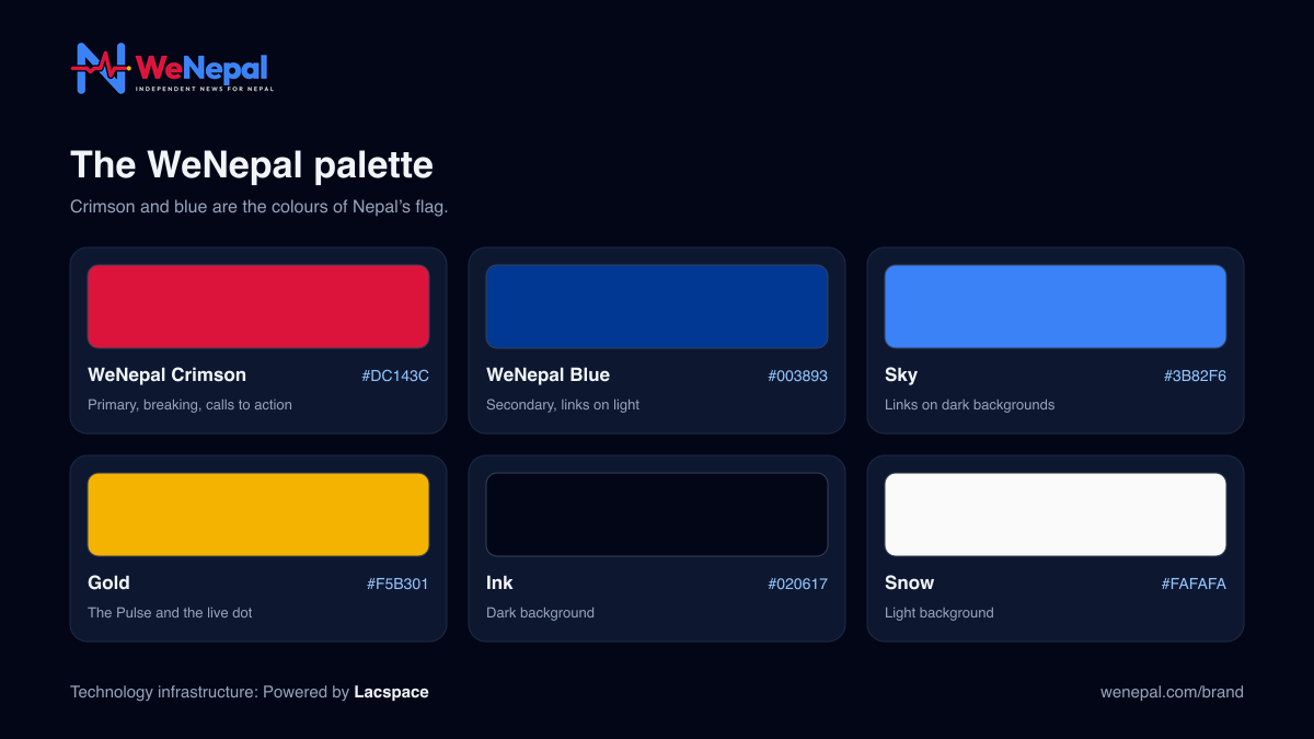
| WeNepal Crimson | #DC143C | Primary colour, breaking news and calls to action. The crimson of Nepal’s flag |
| WeNepal Blue | #003893 | Secondary colour and links on light backgrounds. The blue of Nepal’s flag |
| Sky | #3B82F6 | Links and interactive elements on dark backgrounds |
| Gold | #F5B301 | Highlights, the Pulse and the live dot. Accent only |
| Ink | #020617 | Dark background |
| Snow | #FAFAFA | Light background |
There are four named gradients, each with one job: Breaking for breaking news only, Brand (crimson to blue) for covers and avatars, Pulse (gold to crimson) for the Pulse digest, and Night for dark backgrounds. WeNepal says text and background pairs on its site meet a contrast ratio of at least 4.5:1.
Three open typefaces
| Typeface | Used for | Detail |
|---|---|---|
| Outfit | Headlines and the wordmark | Weights 600 to 800 |
| Inter | Body text and interface | Weights 400 to 600, line height 1.5 |
| Mukta | Nepali (Devanagari) text | 400 to 500 for body, 700 for headlines, line height 1.7, Devanagari numerals |
All three are under the SIL Open Font License. The extra line height for Mukta is not decoration: Devanagari has marks above and below the line, and Nepali text needs more room to stay readable.
Rules that keep it recognisable
- Clear space: keep a zone equal to the height of the mark on every side.
- Minimum sizes: the full mark from 48 px; a compact single-spike mark from 24 to 47 px; the horizontal lockup at least 96 px wide.
- Backgrounds: full colour on white or light; the white version on crimson, blue, the brand gradient or ink; an ink or white plate over photos.
- Don’t: stretch, squash, skew, rotate, recolour, outline, add shadows or glow, crop the mark, rearrange the lockup or change the font.
The rule we like most: download fresh files rather than copying the logo from a screenshot. We followed it for the images in this article, which use the official files.
The press kit
Everything is free to download for press, partners and anyone writing about WeNepal. As listed on 5 October 2026:
| Download | What is inside |
|---|---|
| Full kit (ZIP) | 359 files, 14.8 MB: logos, colours, type and ready-made files |
| Logos only (ZIP) | 206 files, 6.2 MB |
| Brand book | A 7-page PDF, plus a one-page quick reference |
| Palette files | SVG, JSON, CSS, SCSS and GPL colour tokens |
| Ready-made assets | Profile pictures, social covers, link preview images and web banners, in English and Nepali |
For interviews or partner use of the logo, WeNepal asks you to write to hello@wenepal.com.
Why a technology company cares about this
Lacspace provides WeNepal’s technology infrastructure, and a brand like this makes that work easier: one palette as code tokens, logo files at exact sizes, type that renders in two scripts. But the identity is WeNepal’s own, and so is every editorial decision behind it (WeNepal: independent news for Nepal). What the brand promises, short, sourced news you can recognise at a glance, is delivered by the newsroom’s rules (How the WeNepal newsroom checks every story).
Keep reading: WeNepal: independent news for Nepal · How the WeNepal newsroom checks every story · Nepal news in two minutes: the Pulse · The WeNepal app: Nepal in one app
WeNepal is an independent news platform. Lacspace is its technology provider: it supplies the technology infrastructure and hosting, and has no say over what WeNepal covers or publishes. This article describes WeNepal as published on wenepal.com on 5 October 2026; features and details can change. WeNepal does not represent the Government of Nepal or any public body.
Frequently asked questions
What does the WeNepal logo mean?
The mark is a blue N crossed by a crimson news pulse. The pulse always runs left to right and ends in a gold live dot. Crimson and blue are the colours of Nepal’s flag.
How do you write WeNepal correctly?
One word with a capital W and a capital N: WeNepal. In Nepali it is वीनेपाल. WeNepal asks writers not to use “We Nepal”, “WENEPAL” or “Wenepal” in running text.
Where can I download the WeNepal logo?
From wenepal.com/brand. The page offers every logo file individually, a logos-only ZIP, and a full press kit ZIP with logos, colours, type and ready-made files.
Which fonts does WeNepal use?
Outfit for headlines and the wordmark, Inter for body text and interface, and Mukta for Nepali text. All three are under the SIL Open Font License.
Can I change the logo’s colours?
No. The brand rules say not to stretch, rotate, recolour, outline, add shadows or glow, or rearrange the lockup, and to use only the palette colours.